
**How to Choose the Perfect Colours for Your Curtains or Blinds**
The right colours for your curtains or blinds can elevate your space from ordinary to extraordinary. With so many choices available, it’s easy to feel overwhelmed. However, by understanding a few key principles of colour and interior design, you can confidently select the perfect hues to enhance your home.
Understanding Colour Theory for Window Treatments The Colour Wheel: Your Guide to Harmony The colour wheel is an invaluable tool when choosing colours for your curtains or blinds. It helps you understand how colours interact to create harmony or contrast.
Primary Colours: Red, blue, and yellow. Secondary Colours: Green, orange, and purple, formed by mixing two primary colours. By using the wheel, you can experiment with different colour schemes:
Monochromatic: Use varying shades of one colour for a cohesive and elegant look. Complementary: Choose colours opposite each other on the wheel, like blue and orange, for a striking contrast. Analogous: Select neighbouring colours on the wheel, such as green, blue-green, and blue, for a soothing effect.
The Psychology of Colour Colours influence mood and atmosphere in a space. For instance:
Cool Tones (Blues and Greens): Calming and ideal for bedrooms or tranquil spaces. Warm Tones (Reds and Oranges): Energising, perfect for living areas or creative workspaces.
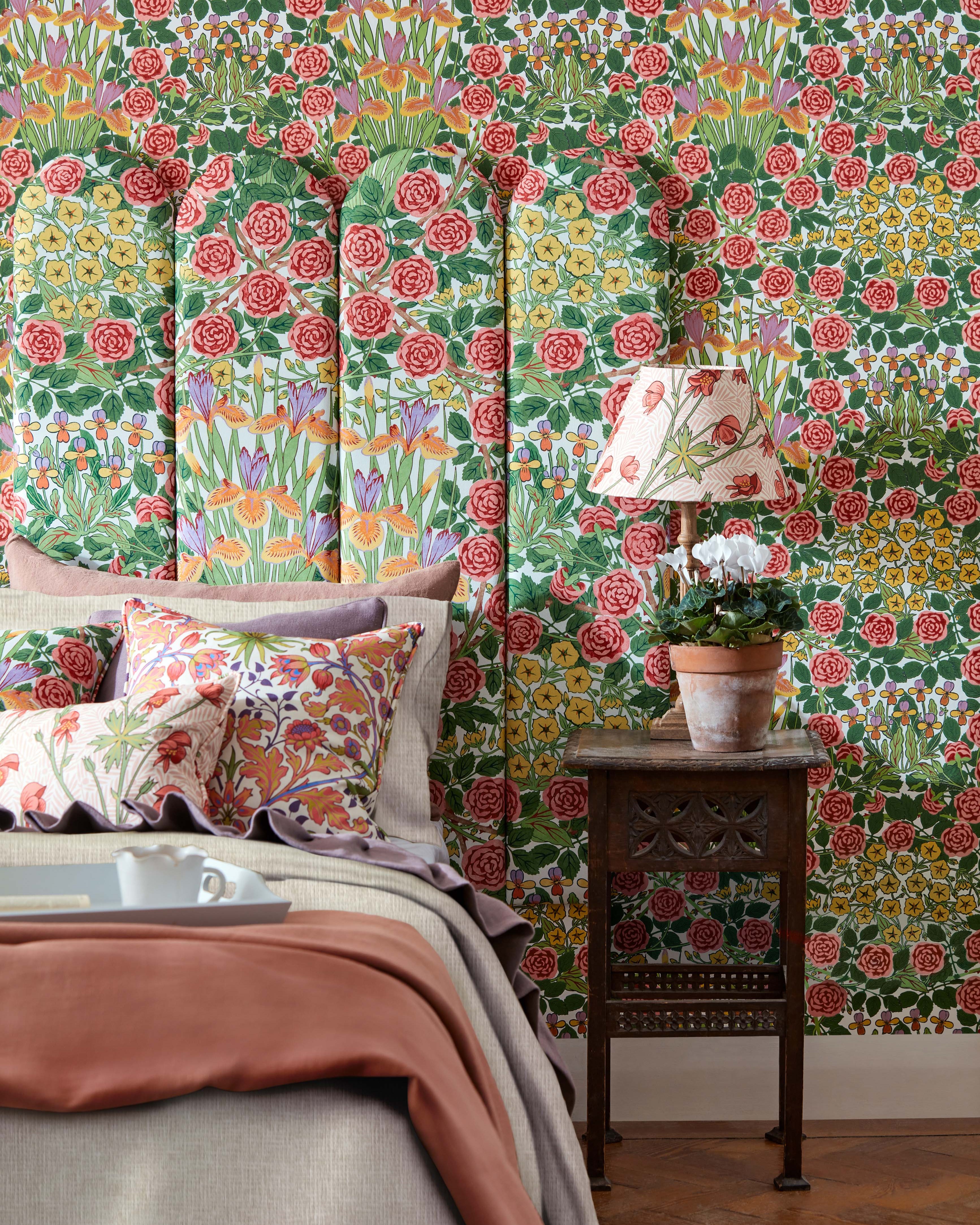
Matching Curtains and Blinds to Your Decor Start with Your Room’s Existing Palette Begin by considering the colours already present in your room—walls, furniture, and accents. Curtains or blinds should either complement these elements or provide a deliberate contrast.
For a Cohesive Look: Choose colours already present in the room, such as in your upholstery or artwork. For Bold Contrast: Opt for shades that pop against your walls or furnishings to make a statement. Consider Light and Space Natural light impacts how colours appear. Test fabric samples in your room at different times of day to see how they look.
Bright Rooms: Cool or neutral tones can balance intense sunlight. Darker Rooms: Warm hues can make the space feel cosier and more inviting. Incorporating Colour Trends for 2025 As we approach 2025, new colour trends are emerging for curtains and blinds. These palettes offer fresh takes on classic choices and introduce bold new options:
Nature-Inspired Tones Earthy hues like sage green, terracotta, and warm ochre remain popular, bringing the tranquillity of nature indoors. These shades pair beautifully with natural materials like linen or jute.
Jewel Tones for Drama Deep emeralds, sapphires, and amethysts are making a statement. These rich, luxurious colours are perfect for creating an opulent vibe in formal spaces.
Soft Pastels with Depth Updated pastels, such as dusty rose or muted powder blue, offer subtle sophistication. These shades work well across seasons, making them a practical and timeless choice.
Tips for Choosing the Right Colour
Assess Your Room’s Style Match colours to your interior style, whether modern, traditional, or eclectic. Neutral tones often work well for minimalist spaces, while bold colours can add personality to eclectic interiors.
Test Samples Always view fabric samples in your space under different lighting conditions to ensure you’re happy with the final look.
Function Meets Fashion Practical considerations matter too. If you need blackout curtains for better sleep, opt for darker colours. For airy, light-filled rooms, lighter or sheer fabrics in soft hues may work best.
Conclusion Choosing the right colours for your curtains or blinds can transform your home. By considering your room’s existing palette, natural light, and your desired atmosphere, you’ll be well-equipped to make a choice that’s as functional as it is beautiful.
For more expert advice or a personalised consultation, visit Patternmatch Interiors. Let us help you create a space that feels just right!